
We have an inherent connection to the natural world. Research shows that even a short time spent close to nature can enhance our physical and psychological health, yet we are living increasingly urban and digital lifestyles, further removed from natural habitats. Indeed in the developed world it is suggested we spend around 90% of our time indoors. The recognition of this has led to the development of products and services that tackle the contemporary human condition of ‘nature deficit’.
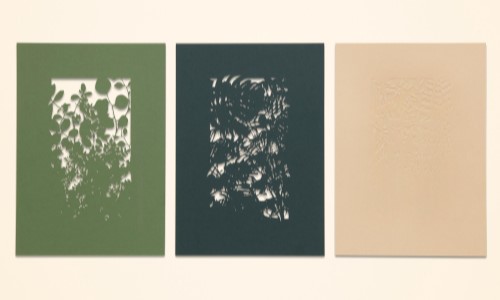
The notion that we are at our best when surrounded by nature, or references to nature, is a major consideration for designers of space, product and materials alike. Whether the engineering of verdant spaces in our urban landscape, or the rise of the humble houseplant, biophilic design is starting to take effect. As a result Green hues are seeing a resurgence across all product categories. Often associated with growth, freshness and fertility, Green is understood to be the most restful colour for the eye to view. Lush, tone-on-tone Green hues can be applied to provide a healing, therapeutic and refreshing quality to spaces and products, while textural elements that replicate or mimic natural elements provide a rich, indulgent feel.


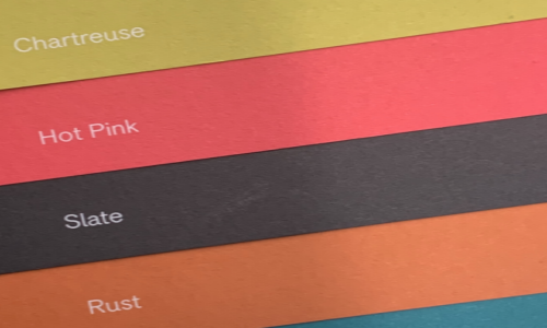
Directly drawing inspiration from active sportswear, and aiming to appeal to our heightened concern for physical health and fitness, the ‘High Octane’ palette features vivid tones of contrasting pink, orange, purple and blue. Projecting an energetic, fast-paced and forward-thinking outlook, this extrovert palette appears to visually vibrate, shouting for attention while projecting a seductive and exciting luminosity.
Bright purple is thought to encourage creativity, while bright pinks, like the colour red, stimulate energy and can increase the blood pressure, respiration, heartbeat, and pulse rate. Bright pink or magenta is also thought to encourage action and confidence.


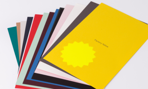
In an era in which we are beginning to re-evaluate what we are consuming and why,
and in which ‘luxury’ goods are ever more attainable, we look to brands, products
and services that offer a greater sense of permanence and longevity. The rich,
weight ‘Permanence’ colour palette comprising of black, deep grey and gold accents projects a tone of heritage, quality and durability, while suggesting a message of connoisseurship and expertise.
Psychologically black implies weight, indeed in tests it has been proven people will
think a black box weighs more than a white one. The colour black has also long been associated with sophistication and power – limousines, judge’s robes, and priests’
attire are all typically black. Drawing colour inspiration from natural rocks and minerals that take time and process to form, the ‘Permanence’ palette provides a restful and reassuring sense of quality, evoking a mood of power, potential and possibility.


Research shows our attention is increasingly overloaded, and our focus impacted by the modern phenomena of ‘multiple presence’; that is the pressure to constantly be connected and interacting with the digital and real world simultaneously. As we increasingly suffer from a sense of over-stimulation and a feeling of ‘stuffocation’ leads us to question the items that surround us, a predominance of the colour white aids mental clarity, offering a clear and uncomplicated tone of voice. Amongst a sea of choice and a backdrop of clutter, analogous tones of white, cream and soft grey project a message of calm, cleanliness and freshness. A subtle white on white colour direction offers a refreshing, minimalist and timeless approach, reinvigorating fashion, graphics, technology and interiors.
As Leonardo Da Vinci once said “the first of all single colours is white … We shall set down white for the representative of light, without which no colour can be seen.” Far from a simplistic, non-colour more shades of white are available commercially than any other colour, indeed the Japanese have six distinct terms to define whiteness. Historically associated with purity, the ancient Greeks wore white or beige garments to bed to ensure pleasant dreams, while Physicians began wearing white coats in the late 19th century, chosen with the aim of embodying the hope and expectation for healing and recovery.


© 2021 Paper Source